Serenity Spa
Creating a comprehensive digital ecosystem for a wellness brand transitioning from traditional spa services to holistic health partnerships
My Role
UI/UX Designer
Duration
12 weeks
Scope
End-to-End Design
Platforms
Web, Mobile, Dashboard
Deliverables
Research, Wireframes, Style Guide, Designs
Understanding the Brand
Who is Serenity Spa?
A 39-year wellness establishment offering therapeutic massages, custom facials, body treatments, and wellness packages. Their core philosophy: "Healthcare is essential, not optional."
The Problem
Brand evolved into a holistic wellness destination, but the website remained generic, dated, and transactional.
Target Audience Research
Primary
Wellness-conscious professionals, parents, students
Secondary
Health & beauty enthusiasts
Tertiary
Couples & occasion-seekers
Strategic Objectives
Drive Engagement
Showcase Expansion
Franchisee Clarity
Premium Positioning
Design Direction
Embrace
Avoid
Desktop Wireframes
Establishing information architecture and navigation patterns for service discovery.
The Design Challenge
The Complexity
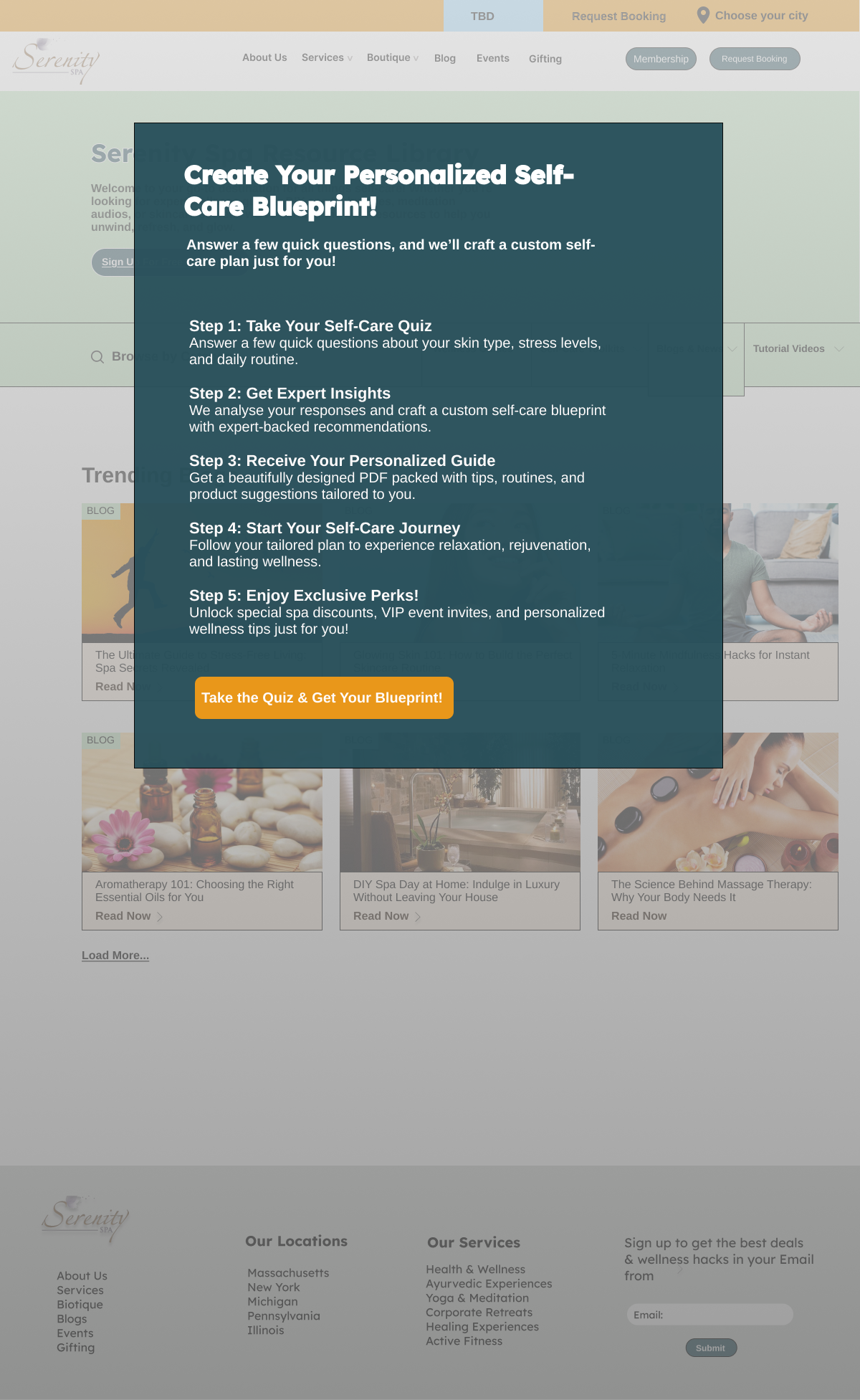
Website needed rich content (services, events, education) while mobile app required streamlined booking focus. Balancing these without losing the calm, minimalist brand feel.
The Approach
Separate user journeys for each platform. Web for exploration and education. Mobile for quick action and efficiency. Same brand, different optimization.
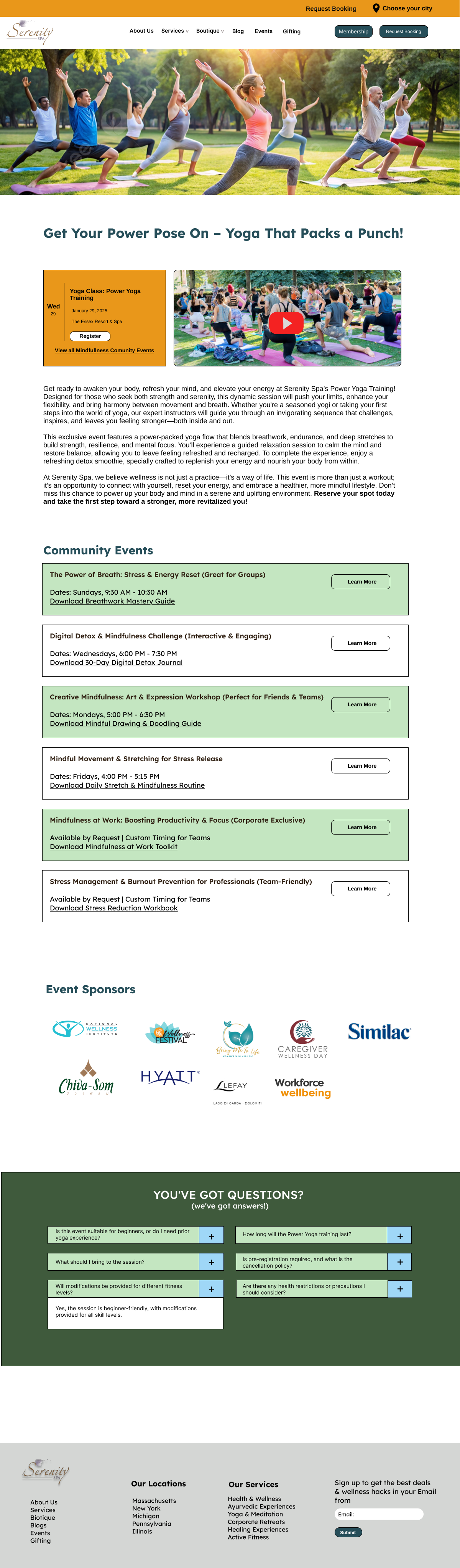
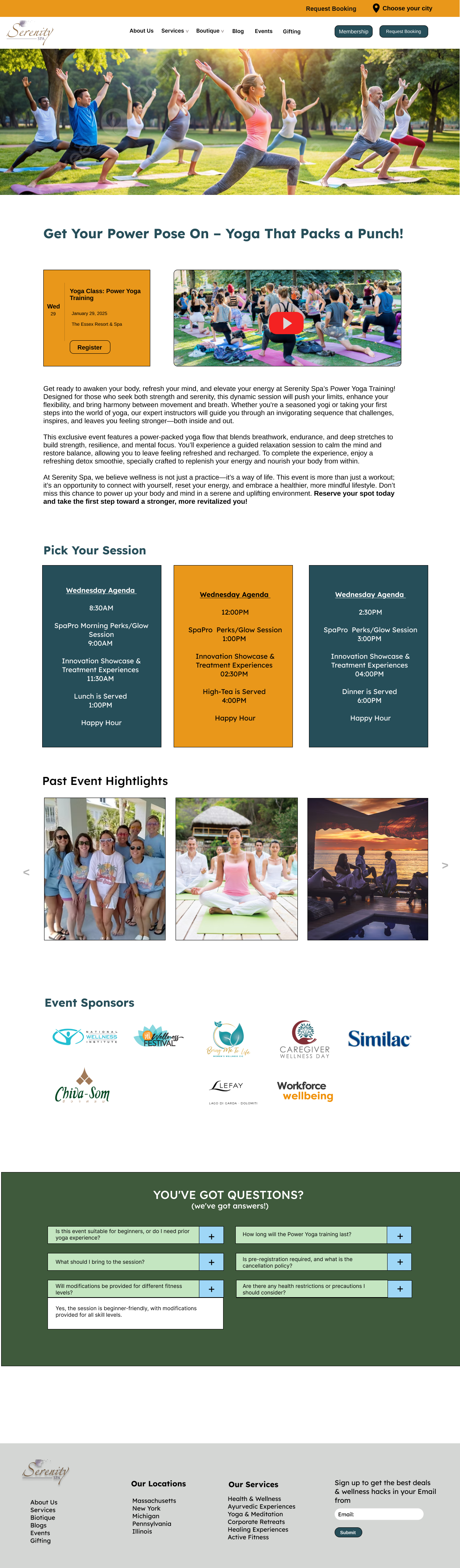
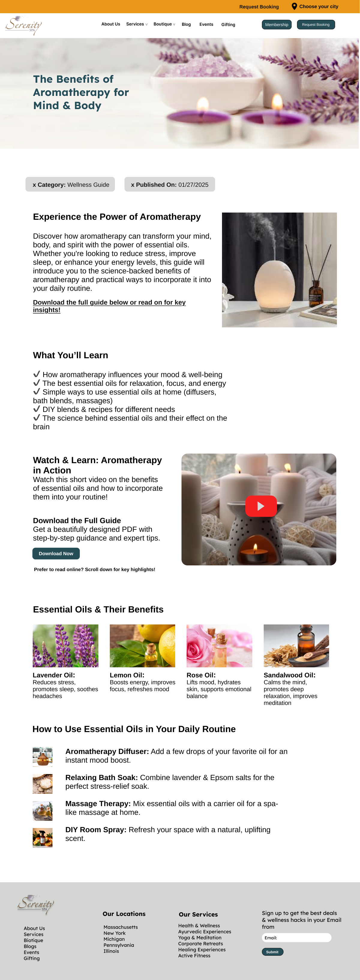
Desktop Designs
Translating wireframes into high-fidelity designs with calming aesthetics and intuitive hierarchy.
Business Intelligence Dashboard
Admin Dashboard
Empowering spa management with real-time insights and data visualizations for faster decision-making.
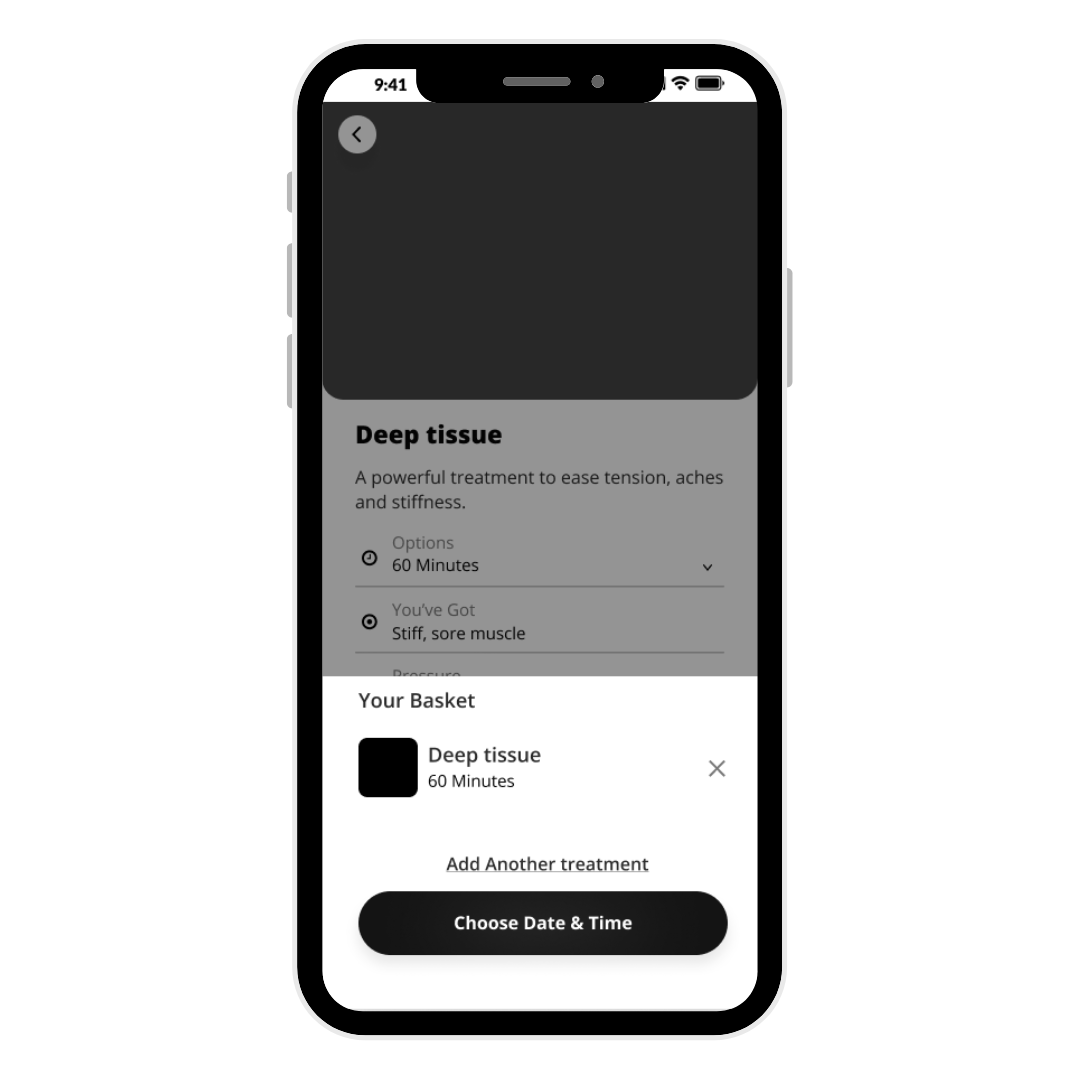
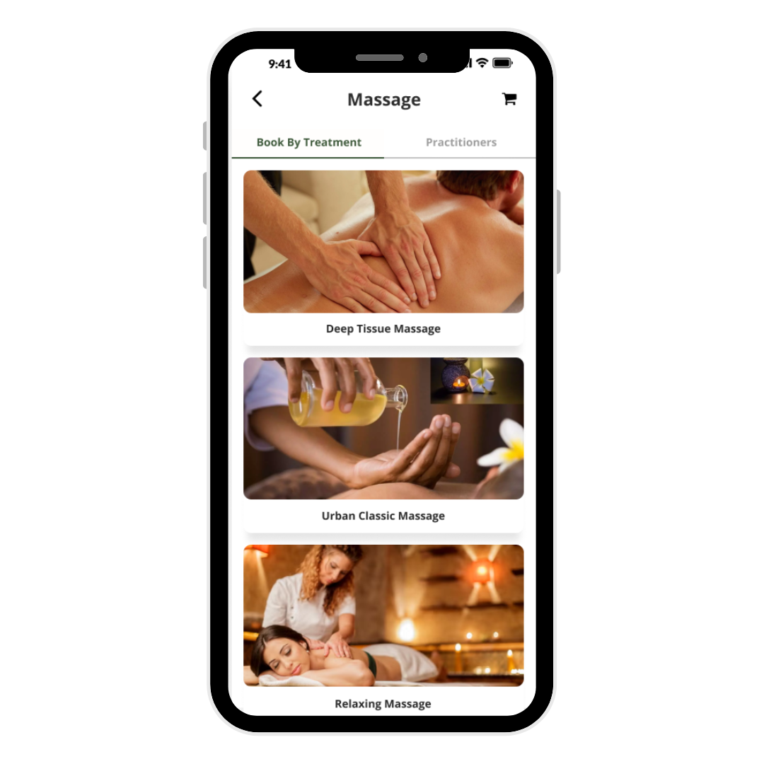
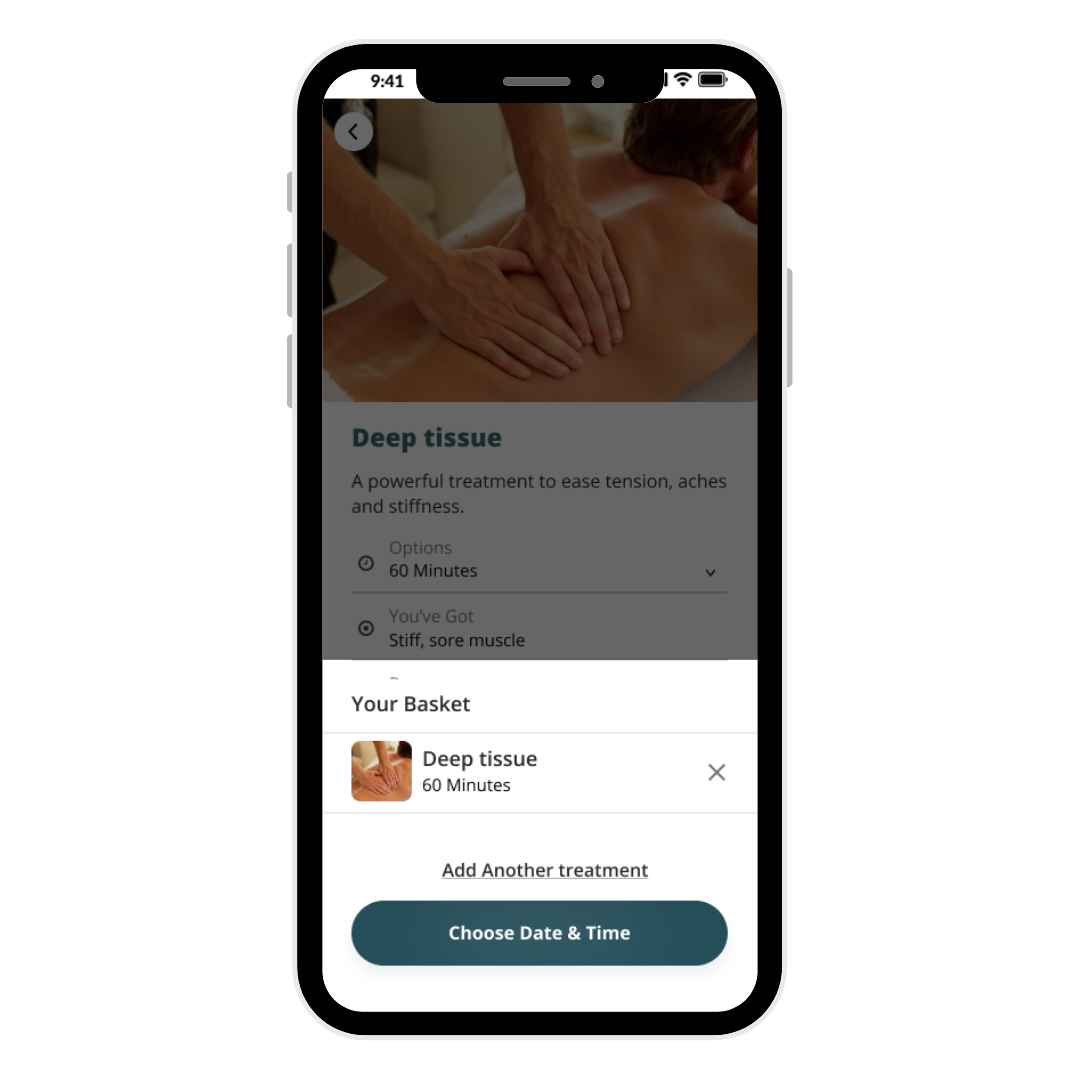
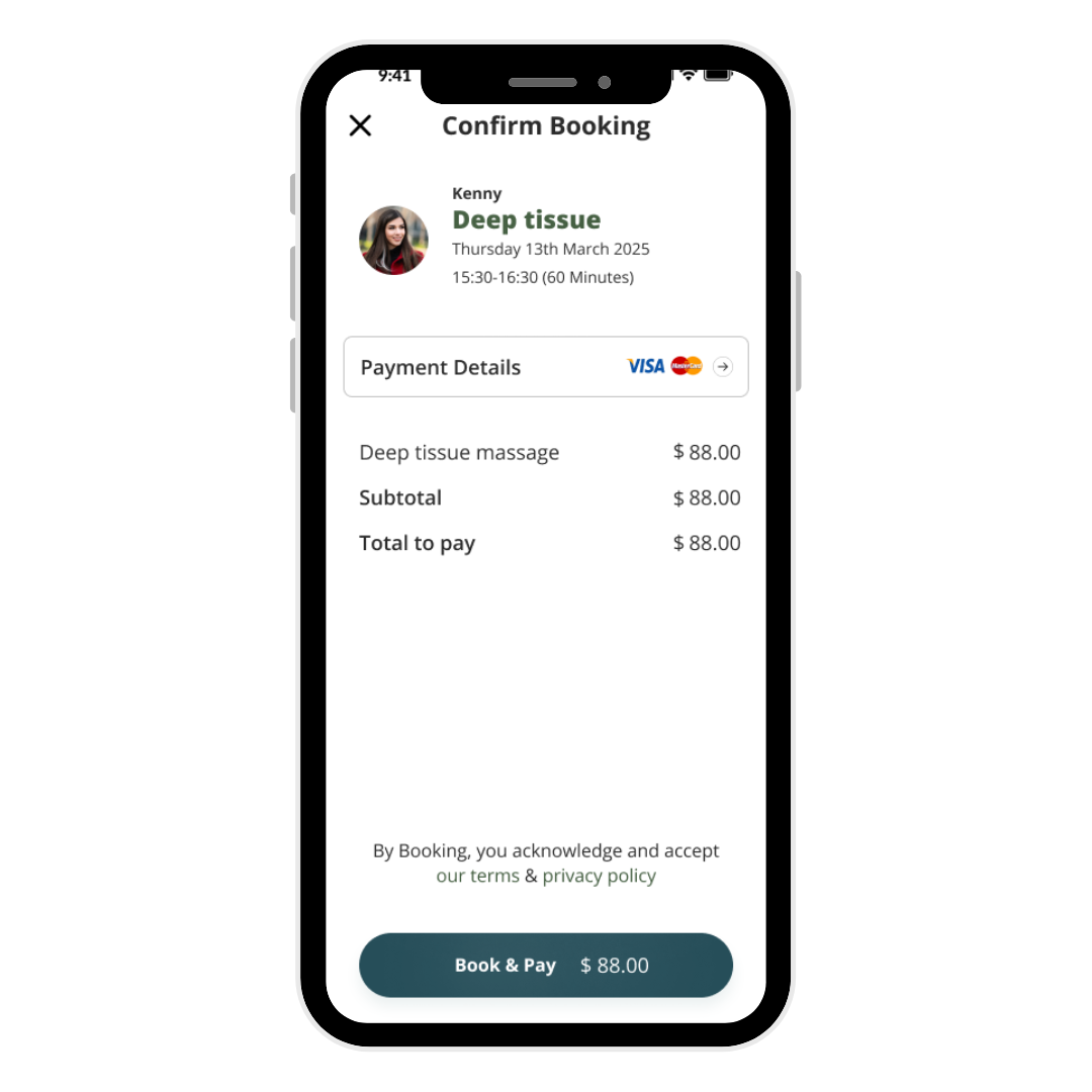
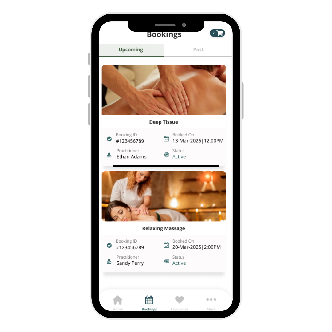
Mobile App Wireframes
Streamlined booking flows optimized for speed and mobile-first interactions.
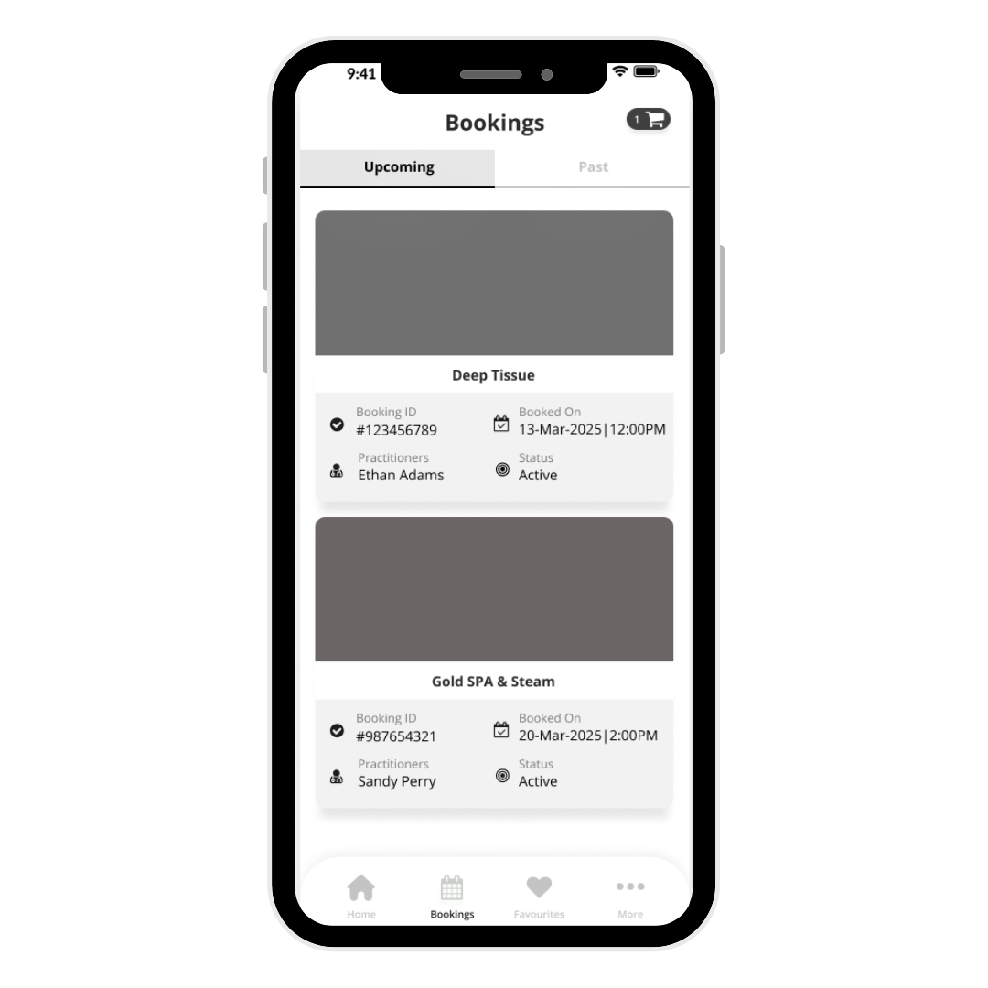
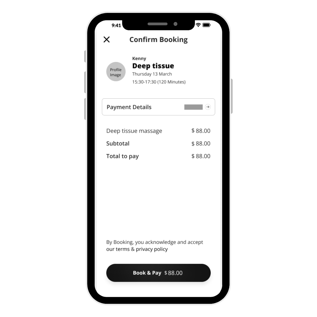
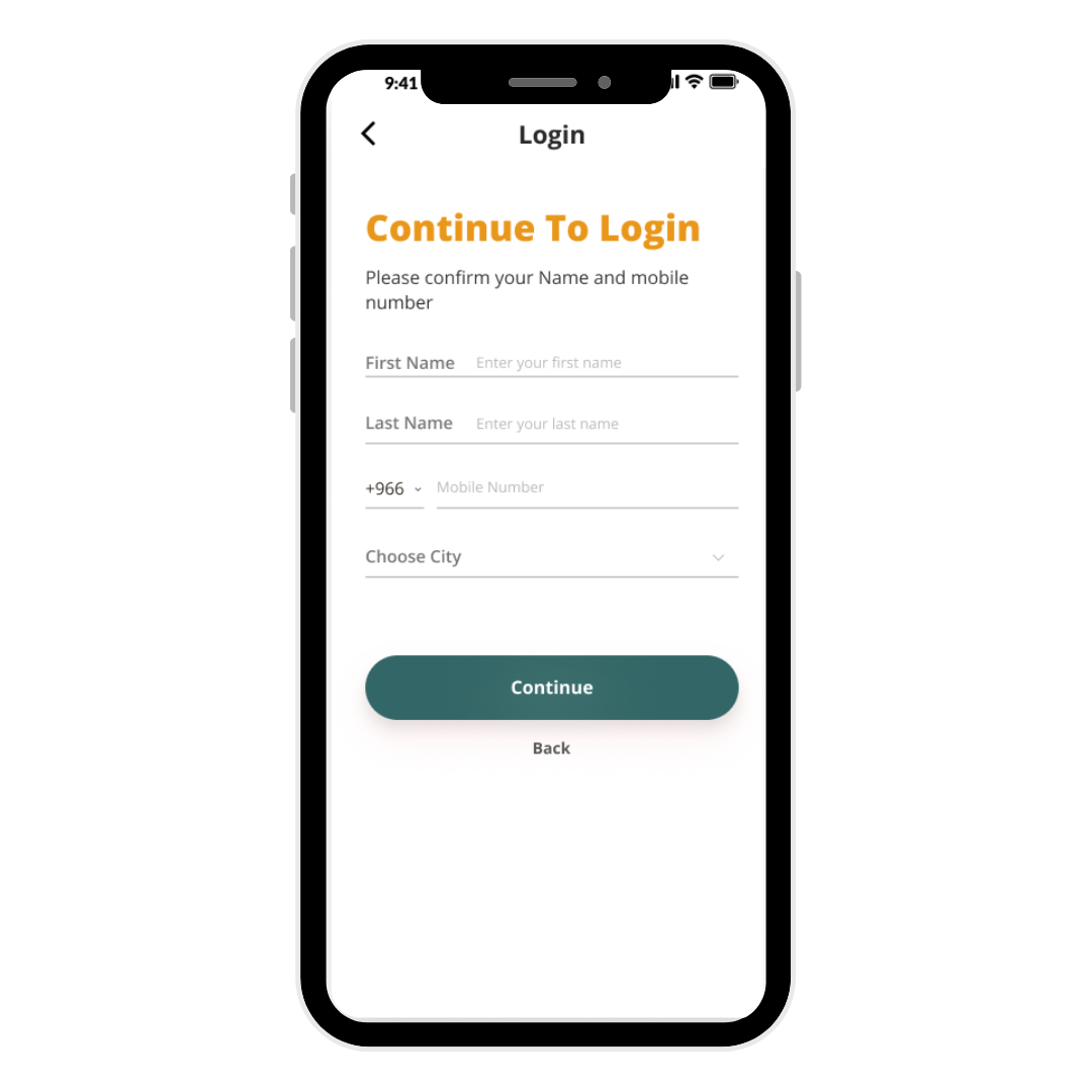
Mobile App Designs
Clean interface prioritizing ease of use while maintaining premium wellness aesthetic.
.png)
Reflections
What Worked Well
Designing separate flows for web and mobile prevented the trap of identical experiences. Each platform optimized for its context.
Regular reviews caught navigation complexity and hierarchy issues early, preventing major redesigns later.
Distinct colors for data types made complex metrics scannable and reduced cognitive load.
What Didn't Work
First iterations included everything, creating clutter. Had to ruthlessly prioritize what users actually needed versus what was nice to have.
Early designs used industry jargon. Feedback revealed need for simpler language to reduce intimidation barrier for new users.
First version overwhelmed with metrics. Learning: Show data that enables decisions, not just data we can show.