The Problem
Market Context: 79% of professionals value project experience over credentials, yet no platform bridges networking and actual collaboration.
How might we help emerging professionals and career switchers gain credible project experience through structured, low-risk collaboration opportunities?
Research Insights
Finding: Users don't struggle to network - they struggle finding relevant collaborators and overcoming hesitation to reach out.
Competitor Gap Analysis
Key Gap: No platform positions collaboration as the primary goal with integrated project tools.
Key Findings
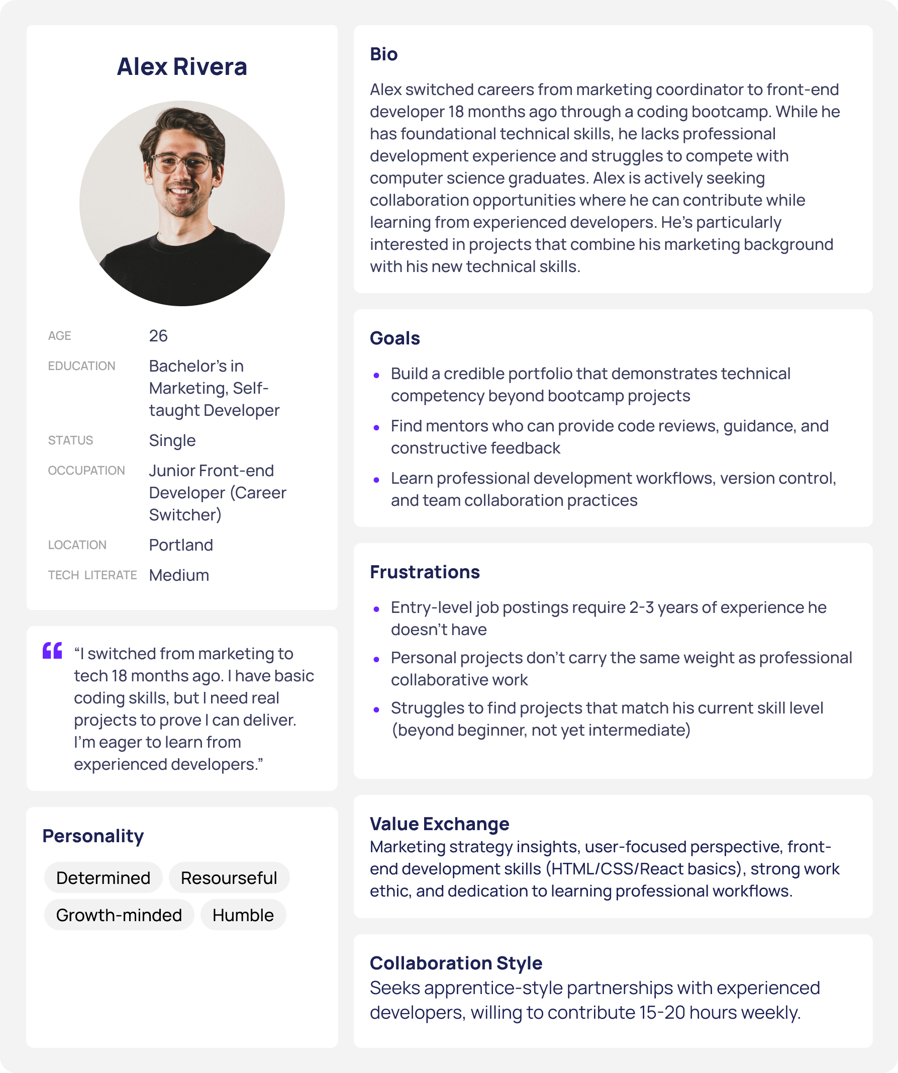
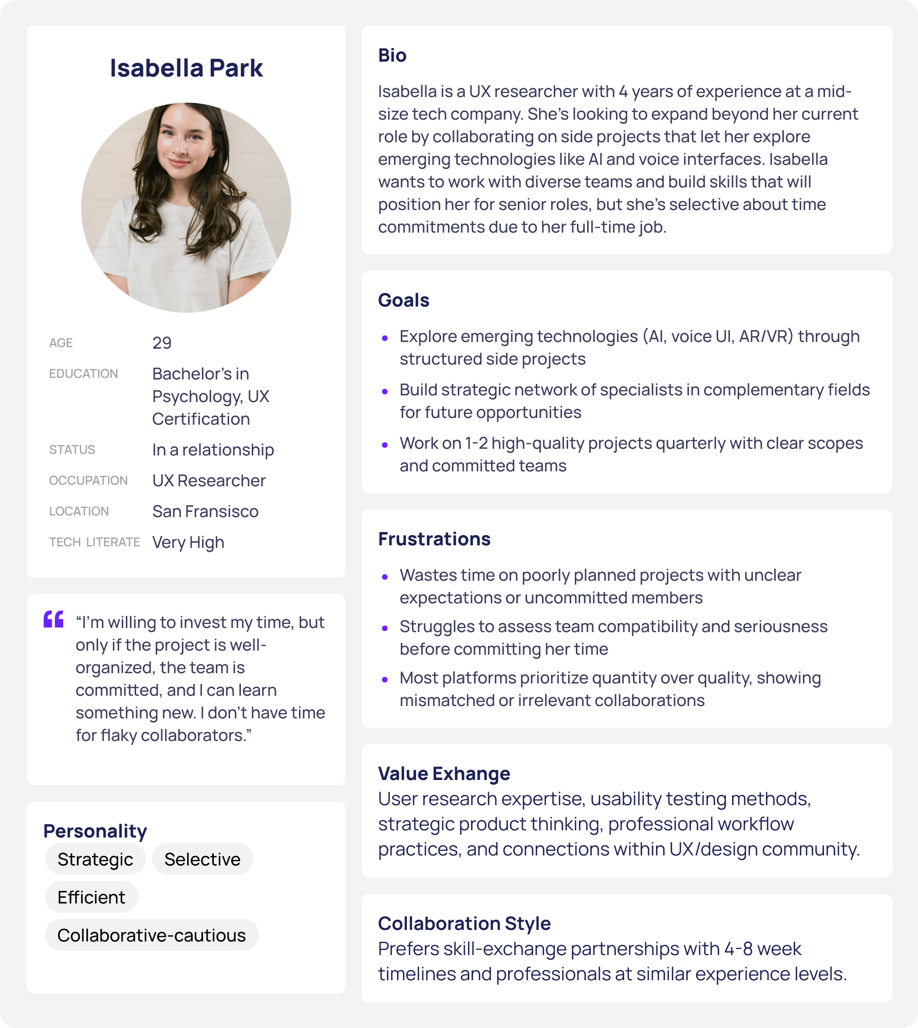
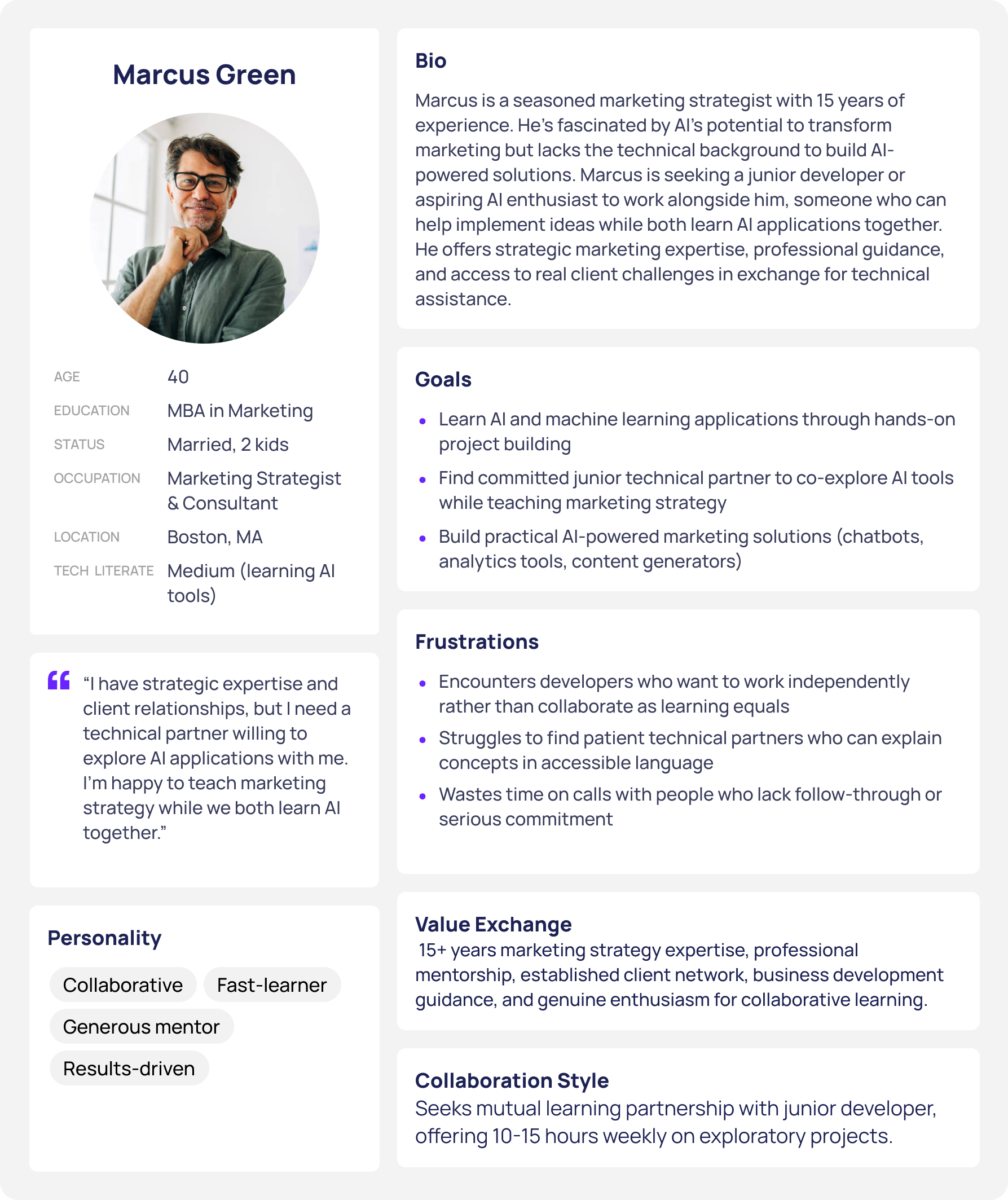
User Personas
Design Decision: Three personas representing different experience levels ensure the platform serves beginners, mid-career professionals, and senior mentors.
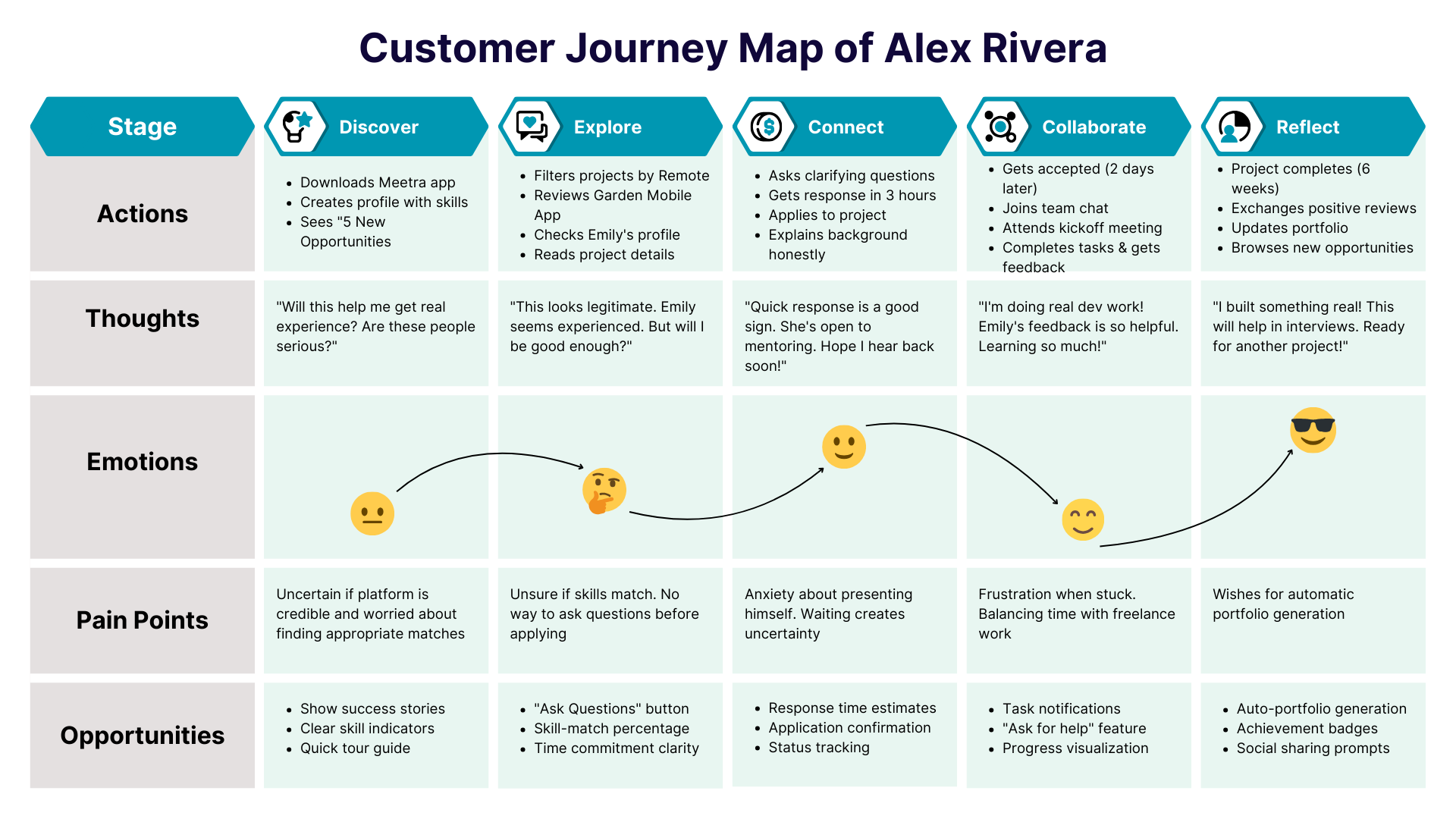
User Journey
Design Decision: Mapped emotional journey to identify friction - waiting for responses caused anxiety, so I added real-time status indicators.
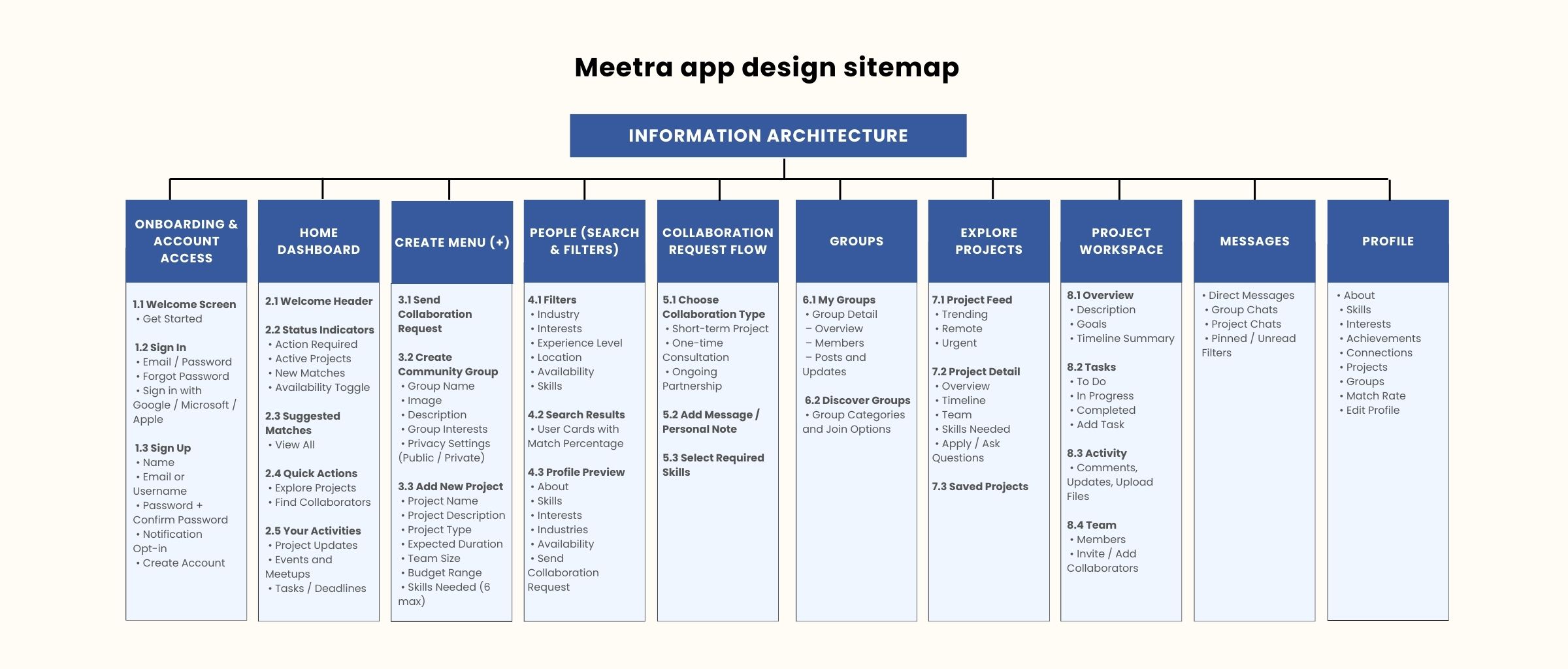
Information Architecture
Design Decision: Organized into 5 core sections (Home, Network, Groups, Messages, Profile) to reduce cognitive load.
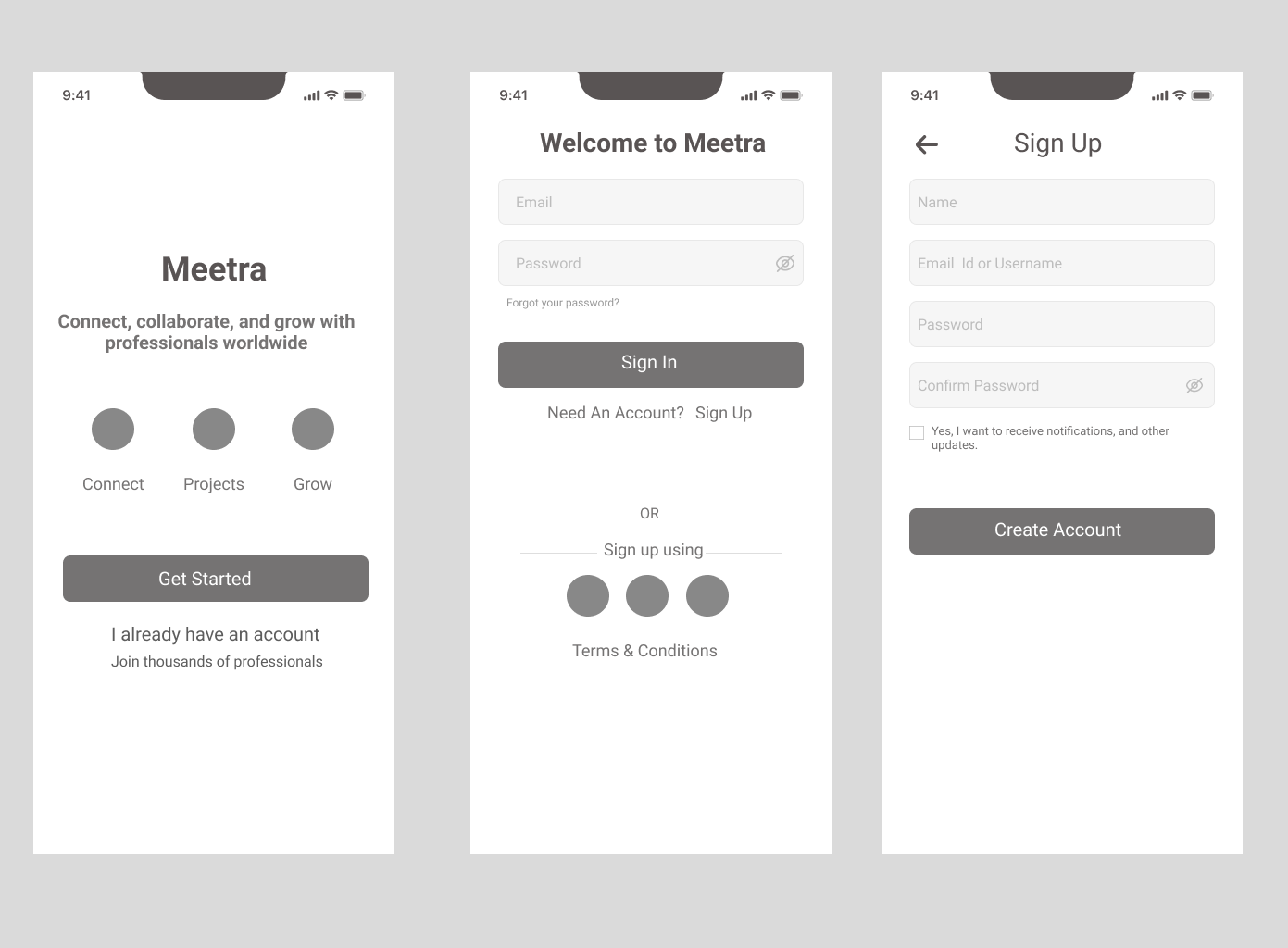
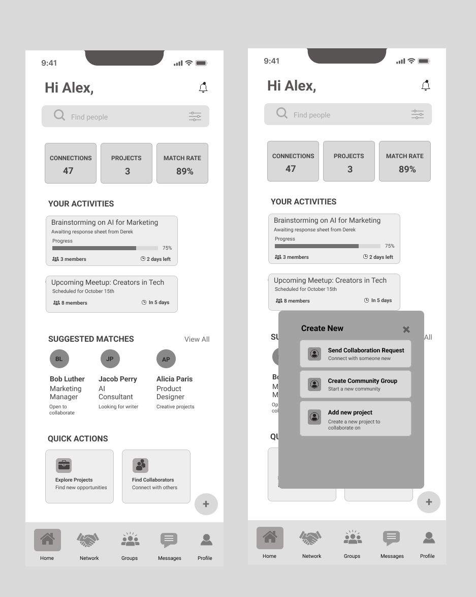
Wireframes
Design Decision: Tested information hierarchy before visual design to validate users could complete core tasks without confusion.
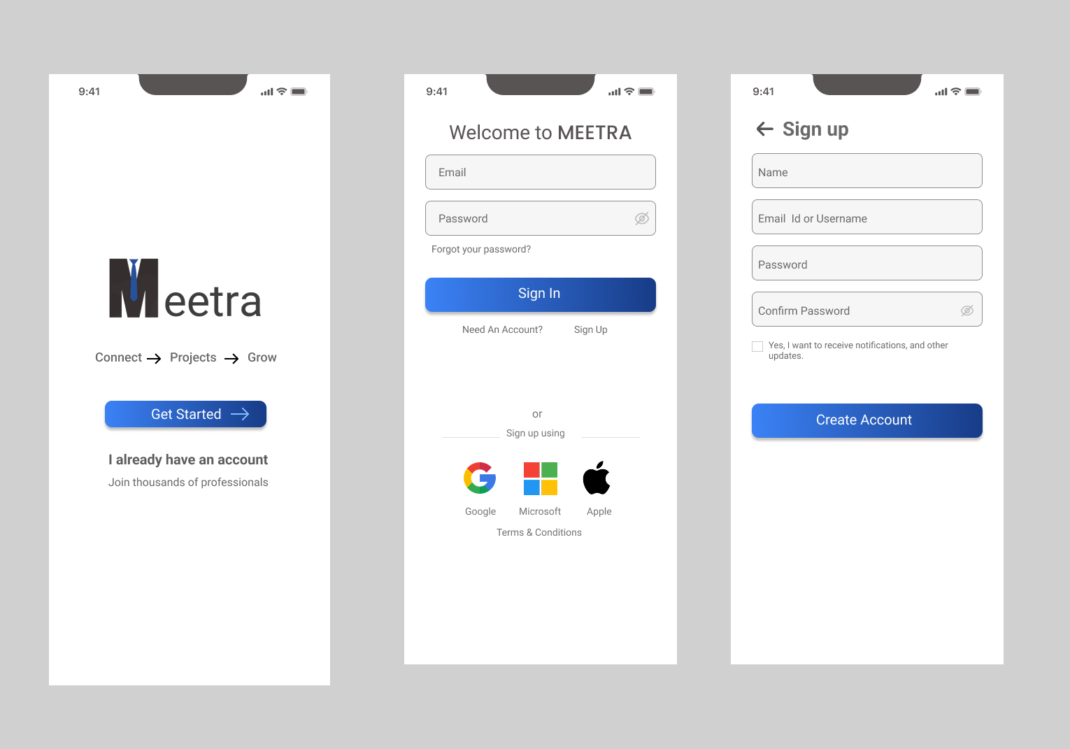
Onboarding
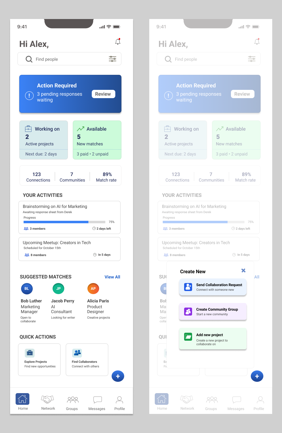
Dashboard
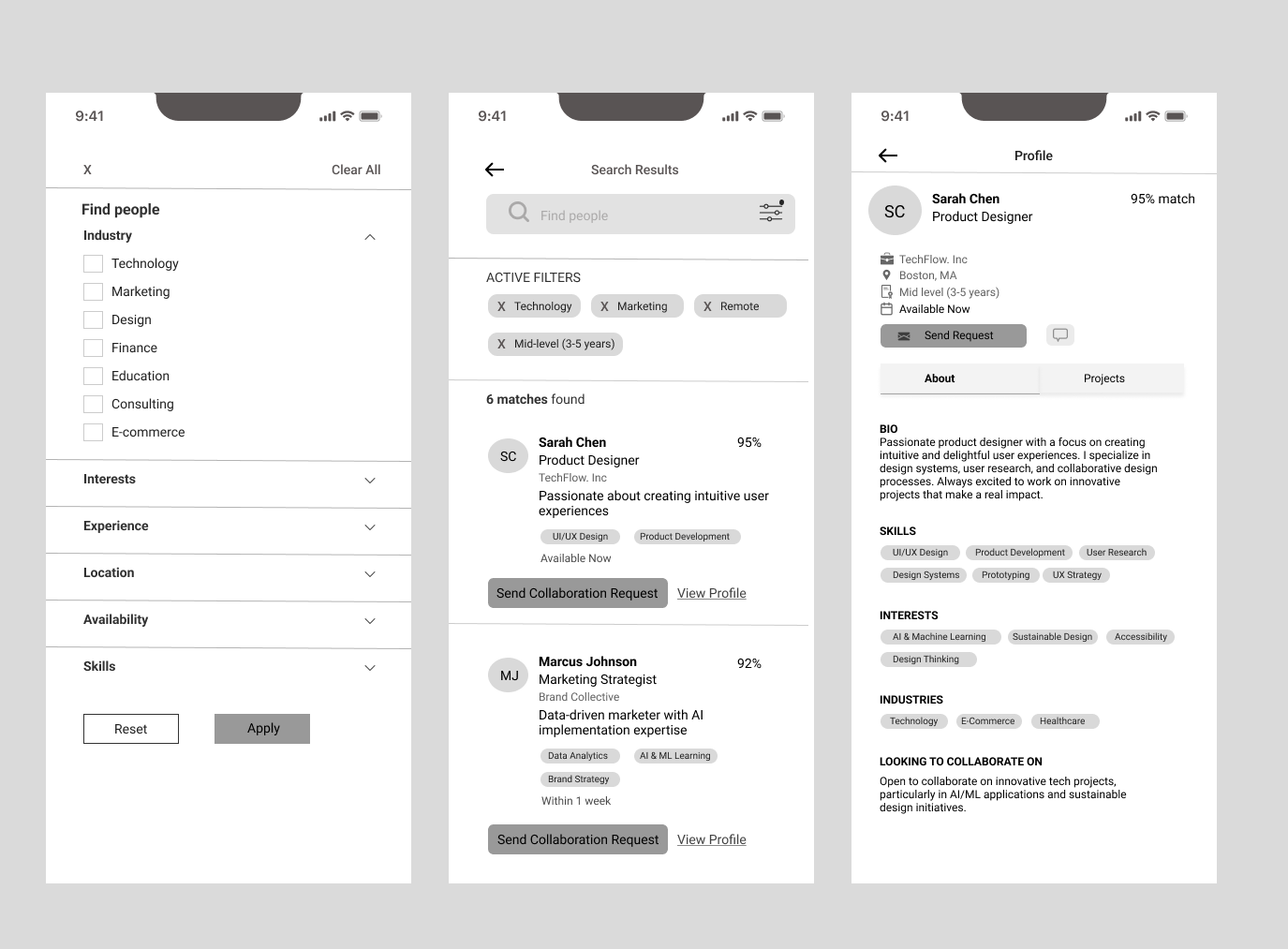
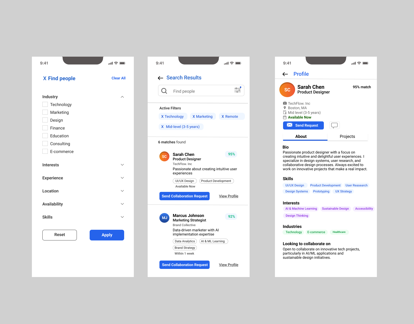
Filters
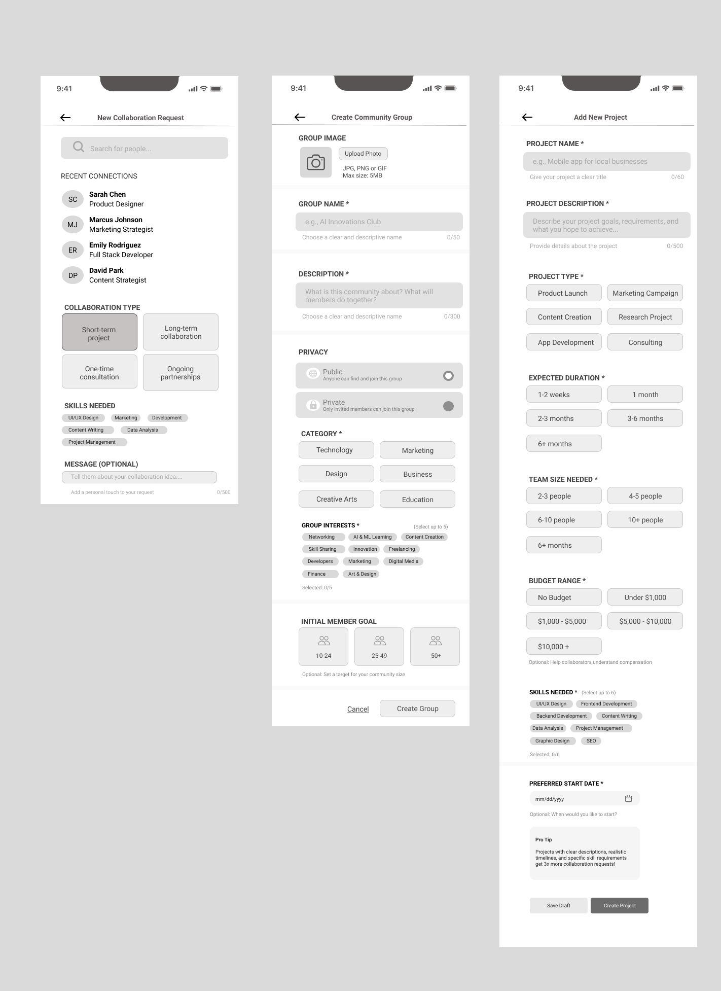
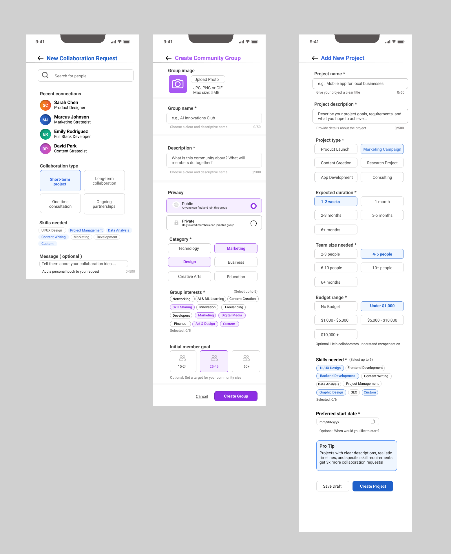
Creation Tools
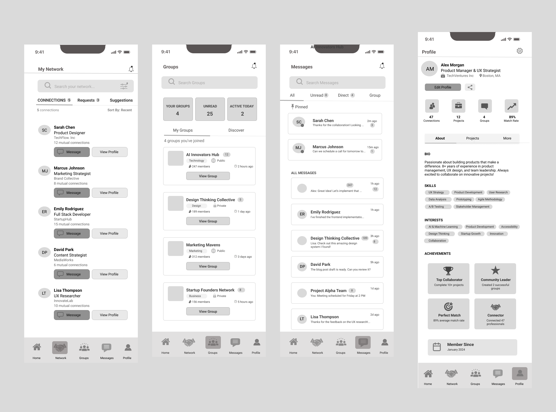
Navigation
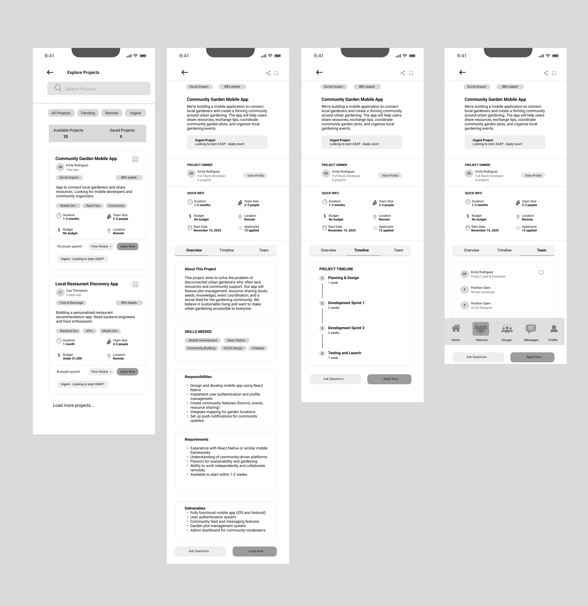
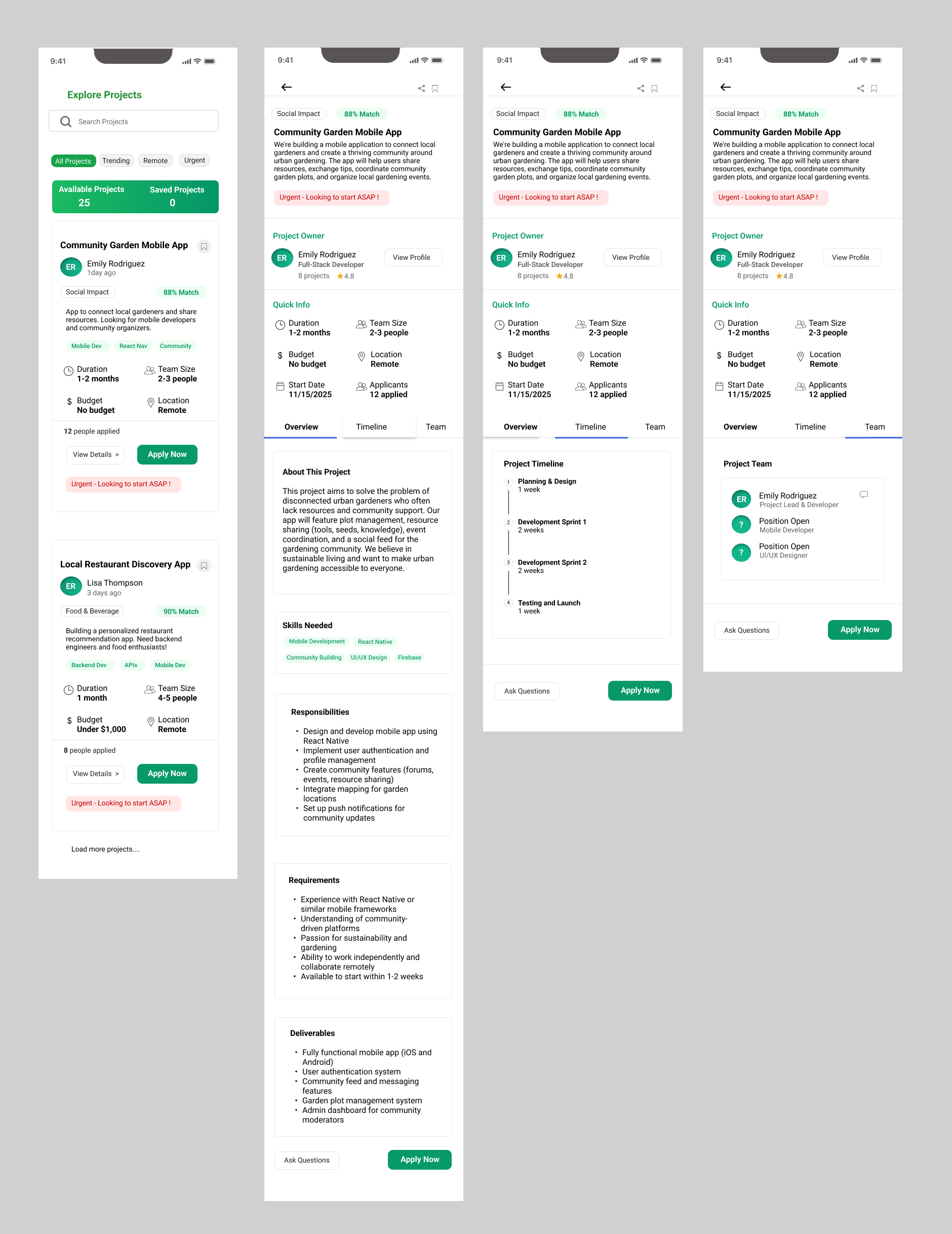
Projects
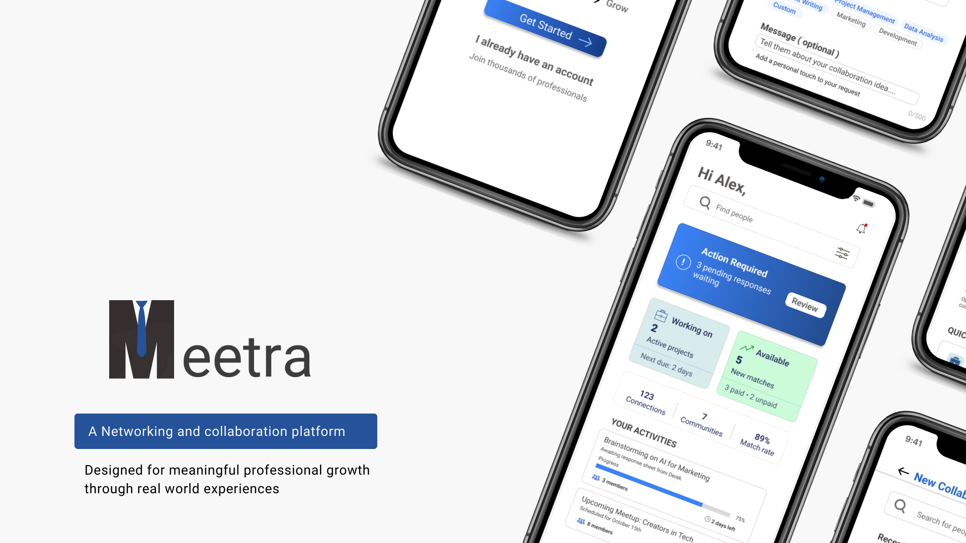
Final Design
Design Decision: Prioritized clarity over aesthetics - every color, button, and layout choice reduces friction in the collaboration journey.
Onboarding
Dashboard
Filters
Creation
Navigation
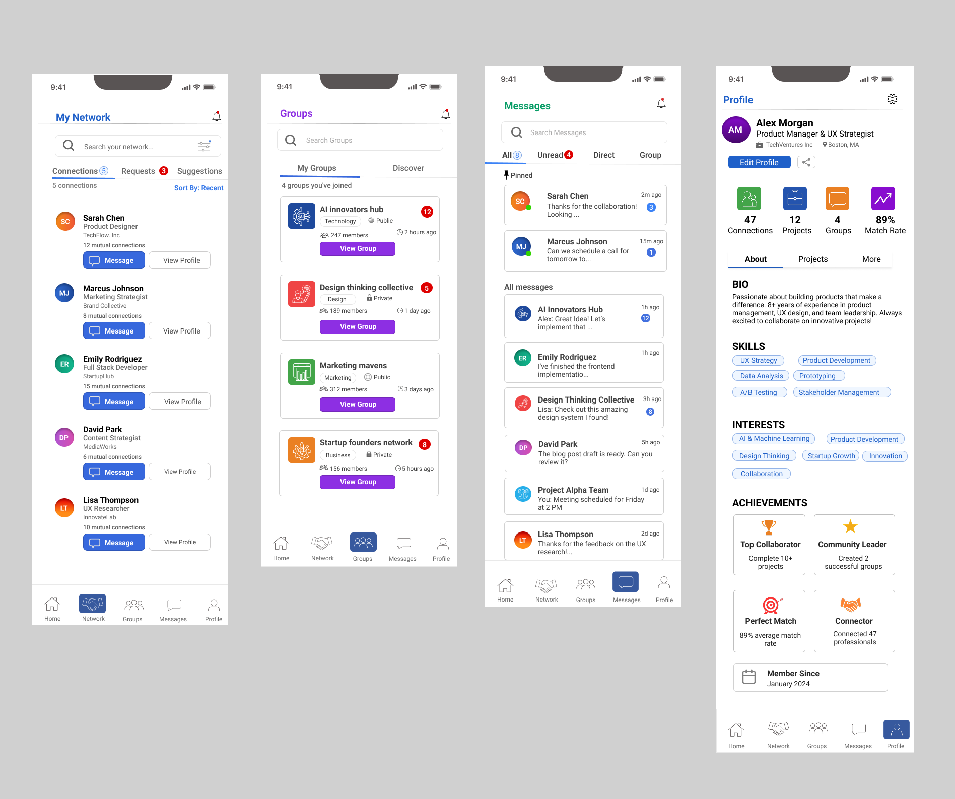
Projects
Projected Impact
Success Metrics: Based on user testing feedback and design heuristics (Academic Project)
Key Learnings
Users Over Assumptions
The pivot from social networking to structured collaboration happened because research revealed what users actually needed, not what seemed clever.
Scope = Execution Quality
Ruthless prioritization enabled shipping a focused MVP. Better to solve one thing well than attempt everything poorly.
Micro-interactions Matter
Small friction points compound. Navigation, filters, templates - each decision collectively determines user persistence.
The hardest lesson was letting go of my initial concept when research showed users needed something different. This taught me that being a designer means serving user needs over attachment to ideas.