Herb & Sip Tea Co.
Redesigning Chicago's specialty tea brand to communicate wellness benefits and expand beyond local boundaries through strategic digital transformation
My Role
UI/UX Designer
Duration
12 weeks
Scope
Website Redesign
Tools
Figma, Illustrator
Deliverables
Research, Wireframes, Style Guide, Designs
Brand Discovery
Who is Herb & Sip?
A specialty tea company selling mood-matched herbal blends with unique ingredients like peppermint, rosehip, ginger, rooibos, and osmanthus petals. They collaborate directly with growers to source rare blends while supporting local agricultural communities.
The Problem
Despite quality products and unique sourcing, the website lacked detailed brand storytelling and herb benefit communication, limiting reach to Chicago only.
Core Mission
Advancing Chicago's hospitality mission
Herb & Sip champions economic health, fosters opportunity, and promotes physical and mental well-being. They exemplify entrepreneurship while providing a platform that resonates with and offers security for the Black community.
Target Audience Research
Primary
Health-conscious individuals (25-45) seeking natural wellness remedies with active lifestyles
Secondary
Those seeking alternatives to coffee/soda, transitioning to healthier lifestyles
Tertiary
Occasional tea drinkers curious about herbal benefits and new flavors
Website Objectives
Drive Online Sales
Capture Leads
Educate & Inform
Build Loyalty
Unique Value Proposition
The Only Herbal Tea Company with All 7 Certifications
Herb & Sip Tea Co. stands apart through direct grower partnerships, deep herb benefit knowledge, and comprehensive certifications ensuring quality, sustainability, and ethical sourcing. They're the first herbal tea company holding all seven industry certifications.
Style Guide
Visual Design System
Color Palette
Typography
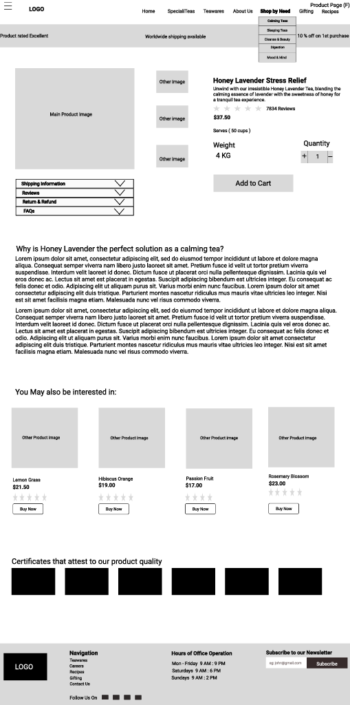
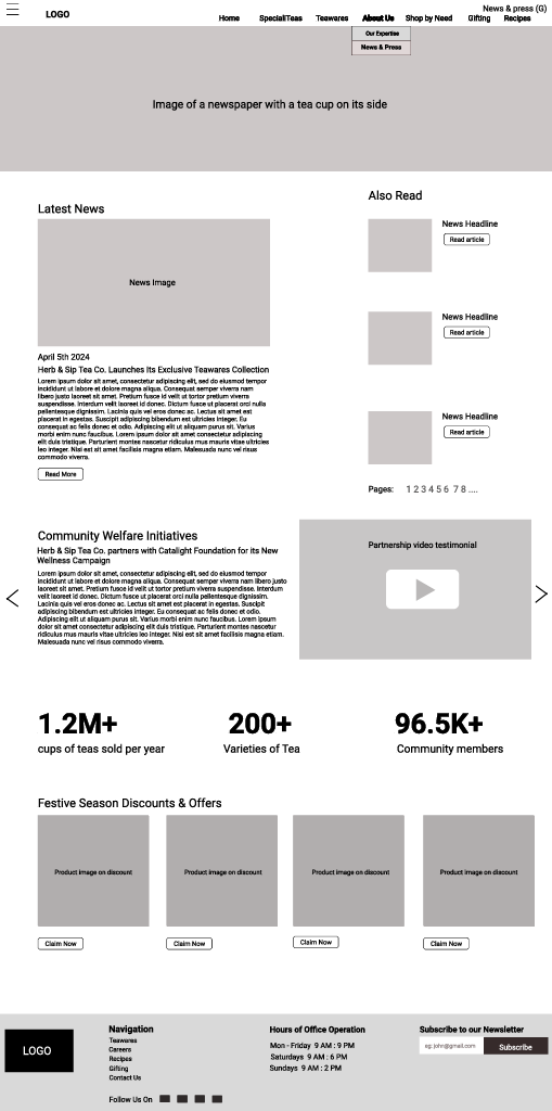
Desktop Wireframes
Establishing information architecture focused on herb education and seamless shopping experience.
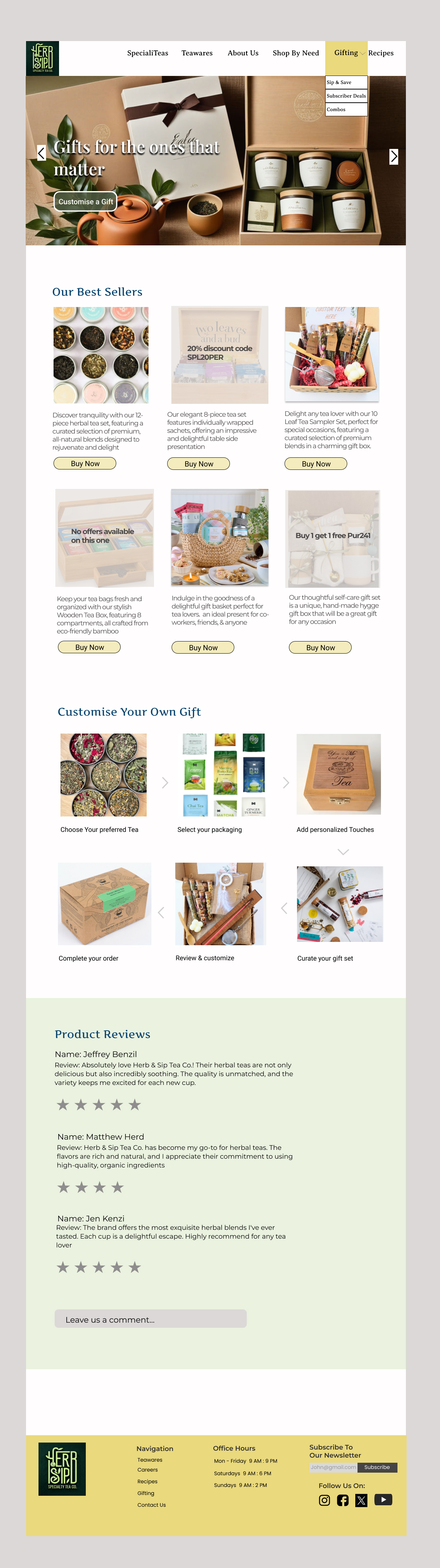
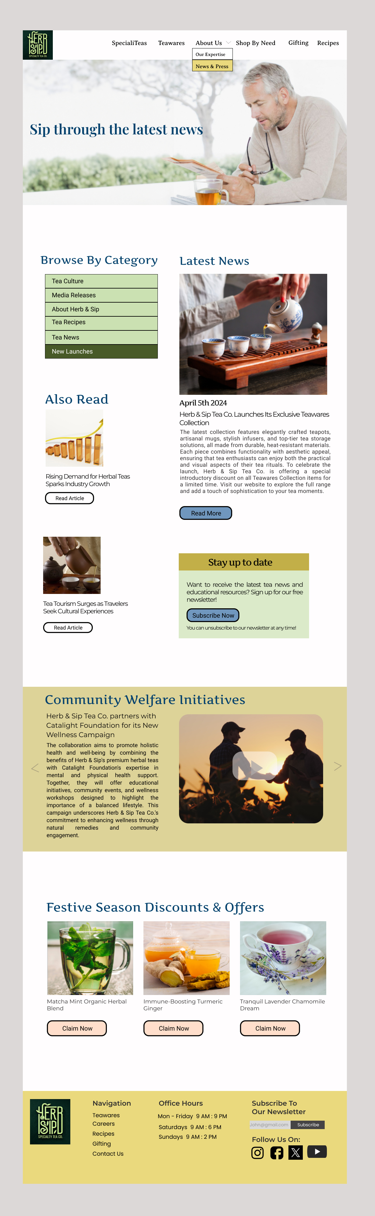
Desktop Designs
Bringing the brand to life with vibrant colors, clear herb benefits communication, and engaging storytelling.
.png)
.png)
.png)
.png)
Reflections
What Worked Well
Creating dedicated sections for herb benefits addressed the core problem—users now understand what makes each blend special.
Prominently displaying all 7 certifications built immediate trust and differentiated from competitors lacking this credibility.
Using the bold yellow-green-orange palette broke from typical tea brand aesthetics, making Herb & Sip memorable and energetic.
What Didn't Work
First iterations overloaded users with herb information. Had to simplify to progressive disclosure: overview first, deep details on demand.
Early designs were too corporate for a tea brand. Finding the balance between credibility (certifications) and approachability took multiple iterations.
Initial copy felt too technical with wellness terminology. Shifted to conversational language that educates without intimidating new tea drinkers.